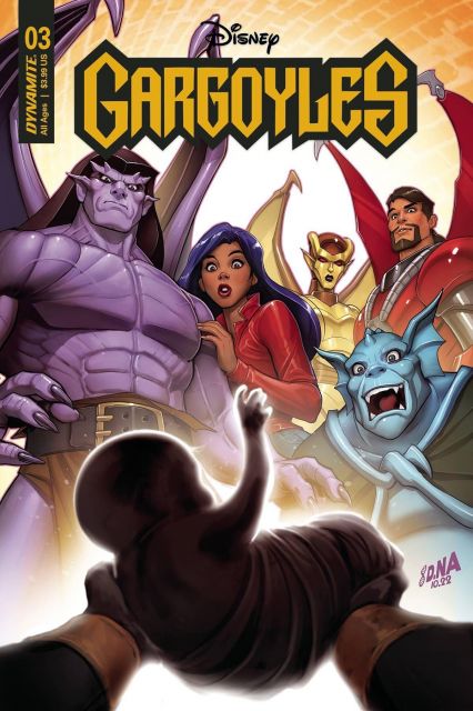
The Gargoyles are the sworn protectors of humanity. One big, happy family — with a baby on the way. Elisa Maza’s brother Talon and his wife Maggie the Cat are expecting a baby, and a lot of trouble. Written by Greg Weisman, with art and colors by George Kambadais and letters by Jeff Eckleberry, Dynamite Entertainment’s Gargoyles #3 brings a whole new meaning to family drama.
Maggie and her midwife have been kidnaped and the Manhattan Clan have of course laid suspicion on their old enemy David Xanatos. There’s just one problem — Xanatos is innocent. Not only that, he has a few good ideas of his own as to who could be behind the kidnapping — Goliath’s clone and enemy, Thailog, who’s been plotting to seize Talon and Maggie’s mutant child. Not only that, Xanatos has a few good ideas on how to get revenge and the baby in one piece, but not without a price.

Gargoyles #3 suffers from its disorganized page layout and inconsistent pacing. That isn’t to say that this isn’t a good issue — Greg Weisman’s story is solid, with its clever balance of Saturday morning cartoon humor and charm, action sequences, with a good dash of interpersonal drama and poignant emotional depth. All these elements are here, especially with the impending birth of Maggie and Talon’s child, the real fear and panic among the Gargoyles, the slick nastiness of Xanatos, and to a greater extent, Thailog. This is capped off with some genuine heartwarming and even downright adorable moments once the dust of the battles settle. Unfortunately, these good elements are compromised by the way the pages, lettering, and writing are presented.
Letterer Jeff Eckleberry and artist George Kambadais’s muddle their otherwise solid work by pushing too many elements of the story onto a single page, not allowing the narrative to flow or their visuals to breathe. The camera for the panels jumps from angle to angle so quickly that it can be hard for a reader’s eyes to follow without getting confused. Given the weight of the story, Gargoyles #3 would have benefited from slower pacing, less ambitious visuals and a bit more space between the actions. There are sequences within this issue that demonstrate the effectiveness of a less-is-more approach, mainly those that occur after big climactic scenes.

Kambadais is single-handedly responsible for the visuals in this issue — from the inking to the color work. His style, a distinct blend of thin, delicate line art and bold graphic color shapes and painterly, splattered textures. Characters are rendered in a clever blend of hard-line cell shading and soft painted splash lighting. This contrasts nicely with the backgrounds, which are extremely stylized, heavily textured with digital grain and paint splatters. The color palette is highly saturated, with certain tones dominating the scenes depending on the level of activity portrayed. Bold fuchsias, gloomy, moody blues, vibrant lilac purples and flashes of red, yellow and green throughout. Despite being unfocused and scattered, they are united by Kambadais’s use of loft light layers to create a cohesive color temperature.
Gargoyles #3 is about as chaotic, unfocused and messy as Maggie’s birthing process, with plenty of growing pains — but the clever spread visuals and character development show method in its madness.







Leave a Reply