Highlights
- Laurin Kelsey, the production designer, molded the sets in “The Fall of the House of Usher” around the script’s numerous Edgar Allan Poe references.
- Each character, including the children, has their own distinct and grounded space, with attention given to their individual characteristics and differences.
- The use of color was crucial in the series, with each child assigned a specific color that became more saturated as their story progressed, adding to the intensity of their experiences.
Mike Flanagan’s latest series, The Fall of the House of Usher has taken Netflix by storm. Following the success of previous series: The Haunting of Hill House, The Haunting of Bly Manor, Midnight Mass, and The Midnight Club, and several films, Flanagan has frequently stretched the capabilities of the horror genre.
Game Rant had the opportunity to chat with The Fall of the House of Usher’s production designer, Laurin Kelsey, to discuss chat about Kelsey’s latest collaboration with Flanagan, as the pair previously collaborated on Midnight Mass and The Midnight Club. In our chat with Kelsey, she highlighted the series’ Edgar Allan Poe references, balancing the countless characters, and some of the production difficulties.
RELATED: Stranger Things Star Millie Bobby Brown Has Some Thoughts About The Show Ending
GR: The Fall of the House of Usher is filled with Edgar Allan Poe references throughout its several sets. Did you mold the sets around these references?
Laurin: The script from Mike already had a lot of Poe references, so I worked with that first. For some of the more period sets that were more direct Poe references like the Usher’s childhood home, I did go straight to Poe, whereas for something like the children’s homes, I focused more on the characters and what they should have and layered in more Poe.

GR: Each of the characters, especially the children, has their own grounded space. What did the process for crafting these entail?
Laurin: When you have a bunch of ridiculously wealthy folks that are all from a similar upbringing in the same city and at a not-too-big age range, how do you make their spaces feel different? When I approached the children’s spaces, it started with a: “Are they in a house or an apartment? If they’re in a house, what’s important to them, how do we incorporate their character and push that boundary with each of them?” As they all branch out in their individual ways, you find the differences between them.
One of the biggest notes I kept getting from Mike was to push it even further. To really let the characterization be bold. Camille, her space is so icy, but someone may have this light pale space and layer in photos of their friends or whatever their elements are, but in this one, he was like “Take it all the way.”
GR: You mention Camille having an icy association. Were the other characters given a similar color theme?
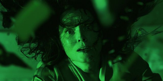
Laurin: Mike said to myself and Michael Fimognari, “I want to give each of the children a color. When they die, that color is super saturated.” We worked backward from that idea and figured out their spaces and how to subtly hint at their color so that when you got to the psychosis and intense emotion and what they were going through, we could bring in more of the color.
Perry is red. He was the one where his wall color didn’t reflect the actual color, but we did layer in a lot of red to his spaces. “Masque of the Red Death” had a lot of lighting support on that. Camille, the ice queen, was silver. Victorine was orange, which I originally thought was a challenging color for her as the icy doctor, but I loved leaning into concrete, which is naturally a little bit warmer. You’ll see orange come in a lot through the costumes as well.
Frederick was blue. Tamerlane was green. Leo was yellow. Technically Roderick was gold and Madeline was purple or lilac. When you get into the childhood home, the wallpaper and everything in the house lean into the warm gold with hints of purple and lilac, wallpaper with gold and purple flowers. Same in the office, golds, and royal purples and blues.

GR: Did Verna have a color of her own or pose any challenges of operating in the spaces that weren’t her own?
Laurin: Verna brought her presence in the lighting. Verna was black like the raven. A lot of it comes through in her costume; the big feather dress, and her lingerie. She was sort of the catalyst. Once they run into her for the first time, that’s when you start to see the color and the light more saturated. She’s always in someone else’s space except the bar. There, she’s got the raven on the shelf and more Poe references. The stained glass in the back has the black cat or the horse from Menzinger. Over the door, there is stained glass with a V in it. It was more about giving it the Poe gothic feel.
GR: Lenore arguably raised and pushed against the Usher family the most. What was her development like?
Laurin: When she’s in Frederick’s house, we never see her bedroom, we don’t get to see her as an individual. When she’s in Roderick’s guest room, it’s been made up for her, but it’s neutral. She didn’t have an official color, but I saw her as gray. If Verna is the devil or death, and her color is black, Lenore is neutral, but she doesn’t lean too far one way or the other.

GR: There’s an interesting scene with Leo where he’s smashing the walls while hunting for the black cat. From a production standpoint, how did you tackle this?
Laurin: Every death scene had its challenges. The nice thing about Mike when we have these complicated sets, he and the AD are great about scheduling. The one thing they did was to shoot in order and block shoot. You always have to be ready to do multiple takes. We provided specific sections of the wall and mapped out where he was going to do that smashing on camera and built 3 or 4 resets to be popped in and out. We purposefully hid the seams with the artwork.
GR: Another death is Perry’s party with the acid rain. What was the process for creating that post-acidic space?
Laurin: Bodies were made down in LA. We had several people there to move bodies on the day of the shoot. Then we had actual special effects doing the blood, goop, and acid mix. We had the paint department blend the acid blood and acid wash into the floor. We used acid destruction for the rest of the set.

GR: Was there a similar process in creating the deterioration of the Usher’s childhood home?
Laurin: That’s probably my favorite set of the show. I found it quite an interesting challenge at the beginning. In the original, the house feels secluded; it’s up on a hill, but in the script, we’re talking about a single mom in the 50s whose children don’t have a legitimate father. She’s a secretary, so what could she afford? It needs to be believable that Longfellow lives at the other end of the street without having set her up too much.
It goes through so many transitions. In the 50s, it has to feel optimistic and family-oriented. That’s where we lean into the golds, yellows, and warm wood tones. When we get into the 60s, when things are starting to go, the kids are now cooking so the kitchen’s a mess, things are just starting to get off kilter and messy. Then we see it in the present day, it’s deteriorated. Roderick says he wants to watch it deteriorate after acquiring it. Layering on 60 years of wear and tear allowed us to transition into a darker tone. I sort of saw the house as a representation of Roderick’s inner soul.
The Fall of the House of Usher is now streaming on Netflix.


Leave a Reply