Highlights
- Tower of God Season 2 features new visuals due to a change in production studio to The Answer Studio.
- Season 1 key staff members returned for the second season, resulting in deliberate visual changes.
- The improved art and fluid animation in Season 2 reflects a shift in focus to experienced characters.
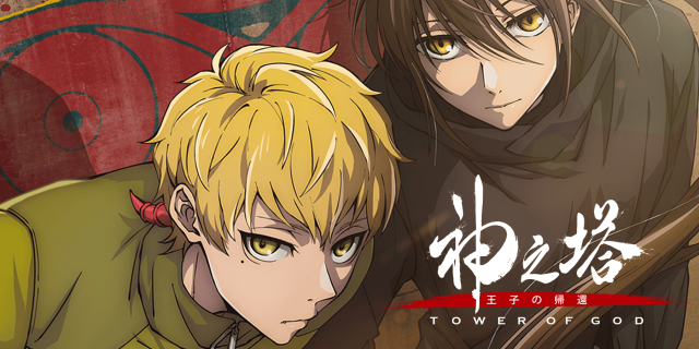
The anime adaptation of SIU’s Tower of God returned with its second season this Summer. The official trailer for this current season was released just over a year ago, with the opening theme preview trailer dropping two weeks before the premiere.
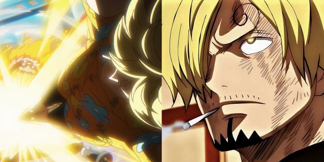
What most would have noticed with the opening preview is the change in the look and feel of the Tower of God anime, but why exactly does it look new and improved?
The Most Obvious Reason
A Change in Production Studio Retaining Key Players
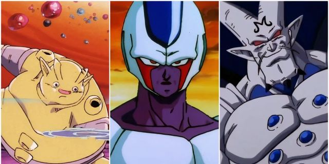
The most obvious reason for the switch-up in the Tower of God visuals is because the production changed hands from staff at Telecom Animation Film to The Answer Studio for season 2. Tower of God season 1 was directed by Takashi Sano, with series composition by Erika Yoshida (series composition, Bocchi The Rock!) for both seasons, and character designs by BLEACH anime character designer Masashi Kudo and Miho Tanino, who is also character designer on the upcoming Blue Box anime. Season 2 of Tower of God was directed by Akira Suzuki, with Kazuyoshi Takeuchi serving as chief director, and Keiichiro Shimizu as art director. Season 1 character designer Miho Tanino continued the role into season 2 at The Answer Studio, joined by Isamitsu Kashima and Seigo Kitazawa. Series composition is once again the jurisdiction of Erika Yoshida, with art direction by Yusuke Ikeda. Both seasons have Kevin Penkin working on the music, and Takayuki Yamaguchi serving as sound director.
|
Tower of God Anime Adaptation |
|||||||
|
Season |
Studio |
Director |
Scripts |
Character Designer |
Animation Director |
Sound Director |
Music |
|
1 |
Telecom Animation Film |
Takashi Sano |
Erika Yoshida |
Masashi Kudo Miho Tanino |
Keiichiro Shimizu |
Takayuki Yamaguchi |
Kevin Penkin |
|
2 |
The Answer Studio |
Akira Suzuki Kazuyoshi Takeuchi (Chief) |
Miho Tanino Isamitsu Kashima Seigo Kitazawa |
Yusuke Ikeda |
|||
While a studio change generally means a change in the look and feel of a given title, many of the key staff members from the first season are back in the second, including scriptwriters, character and sound designers. Character designer Miho Tanino was also chief animation director for a number of episodes in the first season of Tower of God, which means that from an animation and character design standpoint, the change is a deliberate choice and the presence of season 1 staff means that the second season, while quite different, is still molded by the vision of the people who produced the first.
A Nod To The Webcomic
Tower of God’s Biggest Weapon
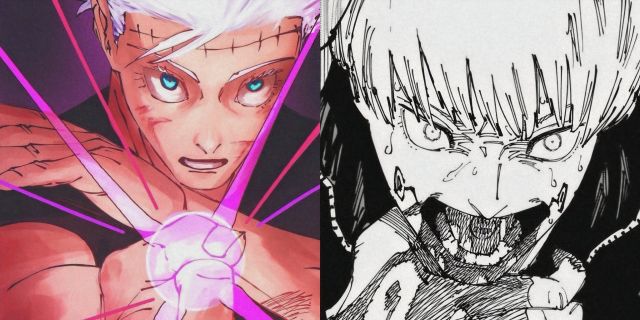
One of the most celebrated aspects of SIU’s Tower of God, beyond the intricately woven story, is the way in which the art undergoes a dramatic shift in quality and tone from the first season of the webcomic. The first season of the anime, with its roughed up outlines and flat colors was a nod to the humble quality of the art of the Tower of God webcomic in its earliest stages. As a result of being on the platform for as long as it has, Tower of God has one of the largest readerships on Naver’s WEBTOON, and when one scrolls down to read the comments posted after each episode, they are met with countless comments from veteran readers of the series encouraging new readers to push through. While the art may not be the best at first, SIU’s work undergoes a dramatic improvement in quality and the author becomes more daring and confident artistically.
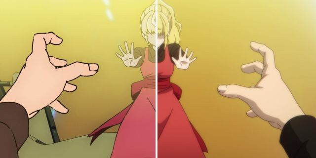
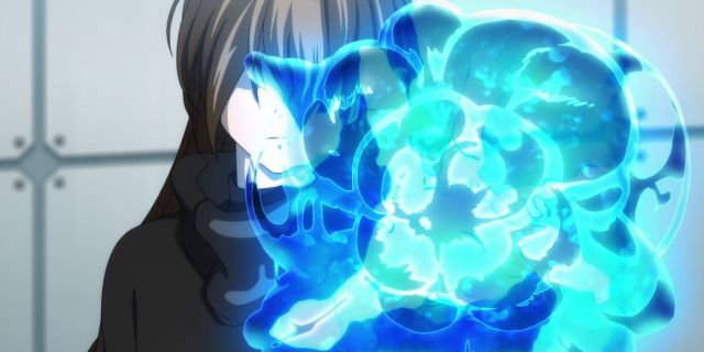
It is a work that rewards the patience and belief a reader has in the concept and the author themselves. The main reason for the change in the series’ appearance lies in the attempt to capture this journey with art and the artist in anime form. Some of the valid criticism of season 1 of the Tower of God anime is that it had a decent look overall, but left something to be desired in some moments. The first season, which adapts the first 78 chapters of the webtoon, had a simpler art style, which was a deliberate choice to better delineate the past from the main story, which is set after a six-year time-skip. While the first season had its charms, there were moments in which the animation was lacklustre, but others that showed immense promise, like Anaak Jahad’s use of her whip-like Green April, or Bam’s Shinsu explosion; in fact, moments of Shinsu manipulation in general were often times the best from the first season.
An Increased Sense of Fluidity
A New Cast and Dynamic
Like last season, we’re thrown into the thick of things, first seeing Yuri Jahad and some of the other princesses before meeting the first of the main characters for this season: Ja Wangnan, an energetic young man who has been trying to clear the test on the 20th floor of the eponymous tower for quite some time. This part of the structure has a lot of people who gave up on their ambition of climbing it, forming some semblance of a life on its floors. Despite every setback, Ja Wangnan keeps trying to get through until one fateful day, he meets a young man named Jue Viole Grace, who bands together with him and forms a team of Regulars to continue the climb. The setting of this season is different to the last because the characters involved are more experienced than the rookies we were introduced to initially.
With a change in scenery, protagonist and experience level, the visuals of the second season speak not only to the improvement in the art of the series author SIU, but also to a shift in focus from beginners to intermediates, and to Bam’s whole new identity as Viole, which isn’t necessarily confirmed yet in the anime, not to mention the fact that readers of the webcomic know that it also isn’t that simple. The visual improvements on not just the art direction, but also when it comes to the animation are to separate the first season and treat it like a memory or dreamlike sequence different from the lucidity and fluidity of the second season. Fans of the series may miss the charm and unique feel of the first season, but the change in the visuals and art direction aren’t simply about a “clean upgrade” or a studio change; the changes are meant to embrace and incorporate a part of the Tower of God reading experience that couldn’t be achieved if it all looked the same either way.
Tower of God is available to stream on Crunchyroll.

Leave a Reply